Photography has always been
interesting to me. I was heartbroken when I found out that I wasn’t able to
take it in high school, and even more disappointed that I didn’t have the time
to explore the field of photography in my free time, as it seemed like I barely
had the time to do everything else that needed to get done. Again in college
there had not yet been an opportunity to combine my passion for taking pictures
into my academic calendar, and I had basically come to the realization that
there never would. That is, until I found out that I needed one more class to
satisfy AIC’s cultural awareness requirement. I was not the least bit thrilled
about having to take a summer class. I love school and value my education
highly, but the idea of being in class while all of my friends were enjoying
their vacation was less than appealing. True fortune happened upon me when
given the opportunity to take this class however. Not only did I finally get to
take a class that allowed me to explore photography, but being online I didn’t
have to worry about physically being in class during the first part of my
summer.
Looking back on what I thought I knew regarding the idea of photojournalism at the beginning of the semester makes me reflect on how wrong I was. I stand by my definition of photojournalism from the first assignments. I worked, researched, and thought about those definitions for a very long time, and I believe that they are accurate. In my first post I said, “Through the use of both videos and photographs, photojournalists aim to tell a story allowing viewers to experience emotion, bring forth old memories, and create new ones. Through photojournalism, the power of images, rather than words, is used to illustrate a piece of a much larger story. The content of photojournalism can influence viewers’ feelings about both present and past events. It can be used to sway public opinion, or bring light to a perspective that was previously overlooked.” While I believe that to be true, I know now that for many photojournalists that isn’t what it’s about. Photojournalism is in fact a paid profession and many out there work as photojournalists for that reason, but I believe that there are many more that do it for experience. They do it because they love it. They do it because it allows them to share their passion with millions of people, most of which they have never even met. In my photojournalist profile I used a quote by James Nachtwey where he says, “I am less concerned with the composition of my photographs and more focused on the effect that they might have on the viewers”. For Nachtwey and others photojournalism is a lot more in depth than just taking a picture.
While reviewing my classmates’ blog posts I was drawn to a quote by photojournalist Deborah Kogan which my classmate Holly wrote about in her profile. When asked about her motivation for becoming a photojournalist Kogan said simply, “I wanted to see how history is being made up close”. Though there have been numerous changes technologically, socially and politically that have affected the field of photojournalism, it is equally important to consider how photojournalism has affected history. Part of what makes photojournalism so magical, is not the first moment when the picture is captured, or the public reaction as it is released for the first time, but rather, the impact that the image can have even a century later. Photojournalism both creates and preserves history. In one of my classmates Bill’s posts he said “Photojournalism can also work as a catalyst for change through the power of the images captured and portrayed to seemingly neutral parties by enlightening our deeper understanding of the world”. It is important to know the source of photojournalism and its history as that paves the way for how the people of the world view current events. Photojournalists document people and events that have the ability to change a nation. They allow us to see what is happening in the local area, across state boundaries and even around the globe.
The moment that I came to fully understand what it meant to be a photojournalist came in the module titled “the art of photojournalism”. For me, pictures had always been a work of art, however art was such a widespread topic that I didn’t fully understand. The content of this module required us to view images and asses them using assessment principles for content and artfulness of the photographs. There were concepts in this module that I had never considered as being deliberate as a person took a picture. As I searched for images and completed the assignment I found myself intrigued. After reading my classmates’ posts and viewing many images, it was like I had learned an entirely different side to photojournalism. That module was my “ah-ha” moment. It has changed the way I look at pictures, and taught me a great deal about their content as well. I have a new found appreciation for each picture that I look at. I can see the pieces of it that make it a great photo, whether deliberate or otherwise, perspective changes everything.
As I have believed even prior to being faced with this question for the first time earlier in the semester, “pictures speak a thousand words” . Literally and figuratively images give us something that the spoken word does not. Regardless of how graphically something is explained, seeing an image never compares. As I have discovered throughout the semester, some pictures may have a very different impact than others. Pictures taken by war photographers for example, may cause people to initially react negatively. They may say that the images are too violent, too graphic and should not have been published. These same images however may be welcomed by others, prompting social change and raising awareness. Images of violence can sway public opinion. Political images can display qualities that prompt social action. Ad Vita said in her profile about Pete Souza, “he must photograph the president and release only photos which will prompt the public to view their president in a positive light”. Other images may inspire feelings of happiness, confidence or love in others. Regardless of the subject, photographs make people feel, and they prompt people to act; and in doing this, they change the world.
 |
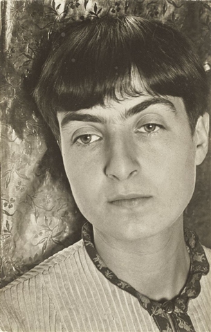
| Image By: Nicole Dufresne |
 |
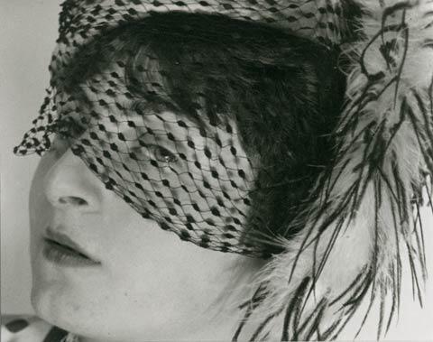
| Image By: Nicole Dufresne |
As
a part of the creative aspect of this post I spent some time over this past
weekend snapping pictures of my younger cousins as they played at the beach.
While I wouldn’t consider my images to really be photojournalistic, I
experimented with a longer lens and black and white shooting just to try
something new. I wanted to capture my cousins having fun and smiling, but not
posing for the camera. I am pleased with how the pictures turned out, though
they are far from comparing to some of the impactful images I have viewed over
this course. One picture that really stood out to me was posted by my classmate
William Garvey. The image was simple, two hands on top of one another, but I will
never forget it. It was both happy and sad as it made me wonder what the scene
around the hands had looked like. After seeing the picture on my classmates’
blog, I followed his link hoping to read more. The picture left an impact on me
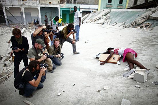
that I was not expecting. A second picture was one that both I and my classmate
Jay Sanders posted of a small girl shot and bleeding on a rooftop. The
collection of those images was so heartbreaking to me. Knowing that people let
her lie there as they took pictures rather than covering her body really felt
like a punch in the stomach. It broke my heart as I read the father’s quotes in
the article, and it is definitely not an image I will ever forget. Though those
are only two examples, images discovered in this course, and the knowledge associated
with our study of photojournalism has prompted me to explore my passion
further. I know that these images and ones that I have yet to discover will
impact me in an entirely new way after taking this course.
 |
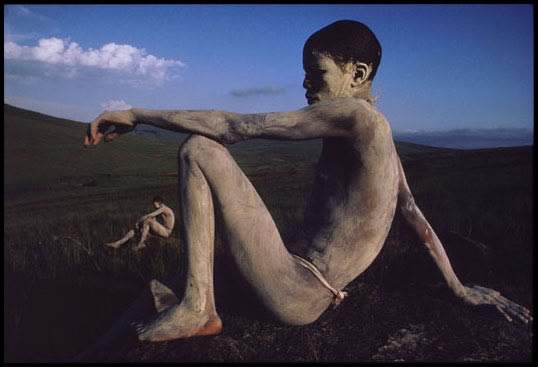
| Image By: Michael Wells Image Source: http://cbrajkovich.com/2011/09/02/sometimes-imagery-and-words-should-stand-alone/ |
 |
| Image By: Paul Hansen Image Source: http://erickimphotography.com/blog/2011/04/07/is-this-photo-ethical/ |


-001.JPG)


.JPG)